Covergasms♥ is an original Book♥Hooker feature that discusses all things cover related!
This week's Covergasms♥ post is going to follow last week's theme of covers that are so sadly unreachable to me, for one reason or another. Without further ado:


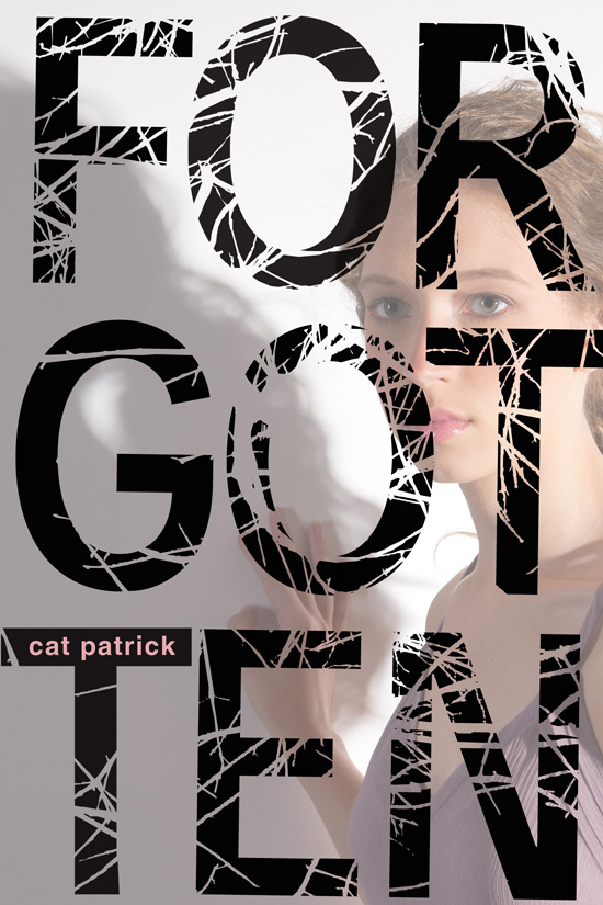
Ok so these four books are actually all the same book! I know right! They are all pretty gorgeous, and so different in their own way, which is really cool. Which one wins me over though? I would have to say the first one (which is the Aussie version). I must admit it was the first version I ever laid my eyes on, so I guess it just stuck with me. I just love the photo that is showcased and absolutely adore the red flowers used in addition to the slight distortion. It reminds me of The Wizard of Oz or something, like when Dorothy and the gang meander through the sleeping poppies.
The book seems really interesting in and of itself as well, having the ever entertaining amnesia factor that I have come to love. A must read for me, if I can figure out which one I want to buy. The other ones, btw, are: Canada version (I think, since it's the only one that I can seem to buy) with the gorgeous lettering taking precedent, the UK version (with the pop of purple butterflies and mysterious shadow), and the US version (with the interesting font and use of colour contrast).
Another book that I can't help but mention is Die For Me by Amy Plum, which I am also dying to get my hands on, but am so very triste after they decided to change the cover. BOOO!


I absolutely love the original design (which is the first one). Not to say that I hate the new one, I just think I fell in love with the first one, and hate to see it go. Now that I'm looking though, I almost like the new one better or the same.. But one can never be too sure with me.. I am so easily swayed, and I dare say that I am only desensitized to the idea of the new cover because I have seen it now more than the original. Hmm..
Oh, my weak mind... --Cheers & Enjoy♥


Oohhh the first one of Forgotten is GORGEOUS.
ReplyDelete